📚 Chapter 13 - Nested Flexbox
🧶 Tags:: #HTML_CSS
🗃 Resources:: [[]]
🔗Links:: https://github.com/SuperSimpleDev/html-css-course-2022/tree/main/1-exercise-solutions/lesson-13
2022-11-10 - 15:14
We created the youtube header using flexbox in this tutorial.
Here are some new elements -
Search Bar -
.search-bar::placeholder{

font-family: roboto,arial;

font-size: 16px;
}
If you want to edit the placeholder you can use '::' and the sub element that you want to modify. This is very useful for making a better design.
Flex-Shrink -
.right-section{

margin-right: 20px;

display: flex;

width: 180px;

align-items: center;

justify-content: space-between;

flex-shrink: 0;

}
Flex-shrink element sets the flex box not to shrink when the page is being resized. Very important for content that's important and should stay on the page.
Width 0 -
.search-bar{

flex: 1;

height: 36px;

padding-left: 10px;

font-size: 16px;

border-width: 1px;

border-style: solid;

border-color: rgb(192,192,192);

border-radius: 2px;

box-shadow: inset 1px 2px 3px rgba(0,0,0,0.05);

width: 0;

}
Width 0 is used in a flexbox to make it shrink with the page, We used this in the search bar as we wanted it to shrink as the page got smaller.
Lesson Code -

Note - We only edited the header in this lesson, but the code is of the full page.
HTML -
<!DOCTYPE html>
<html>
<head>
<title>Youtube.com Clone</title>
<link rel="preconnect" href="https://fonts.googleapis.com">
<link rel="preconnect" href="https://fonts.gstatic.com" crossorigin>
<link href="https://fonts.googleapis.com/css2?family=Roboto:wght@300;400;500;700;900&display=swap" rel="stylesheet">
<link rel="stylesheet" href="video.css">
<link rel="stylesheet" href="header.css">
<link rel="stylesheet" href="general.css">
</head>
<body>
<div class="header">
<div class="left-section">
<img class="hamburger-menu"
src="/Intro-to-html/youtube/hamburger-menu.svg">
<img class="youtube-logo" src="/Intro-to-html/youtube/youtube-logo.svg">
</div>
<div class="middle-section">
<input class="search-bar" type="text" placeholder="search">
<button class="search-button">
<img class="search-icon" src="/Intro-to-html/youtube/search.svg">
</button>
<button class="voice-search">
<img class="voice-icon" src="/Intro-to-html/youtube/voice-search-icon.svg">
</button>
</div>
<div class="right-section">
<img class="upload-icon"
src="/Intro-to-html/youtube/upload.svg">
<img class="youtube-apps"
src="/Intro-to-html/youtube/youtube-apps.svg">
<img class="notification-icon"
src="/Intro-to-html/youtube/notifications.svg">
<img class="header-profile" src="/Intro-to-html/Channel Pics/channel-1.jpeg">
</div>
</div>
<div class="video-grid">
<div class="preview">
<div class="thumbnail-row">
<img class="thumbnail" src="/Intro-to-html/Thumbnails/thumbnail-1.webp">
</div>
<div class="video-info-grid">
<div class="channel-pic">
<img class="profile-pic" src="/Intro-to-html/Channel Pics/channel-1.jpeg">
</div>
<div class="video-info">
<p class="video-title">
Talking Tech and AI with Google CEO Sundar Pichai!
</p>
<p class="author">
Marques Brownlee
</p>
<p class="view">
3.4M views · 6 months ago
</p></div>
</div>
</div>
<div class="preview">
<div class="thumbnail-row">
<img class="thumbnail" src="/Intro-to-html/Thumbnails/thumbnail-2.webp">
</div>
<div class="video-info-grid">
<div class="channel-pic">
<img class="profile-pic" src="/Intro-to-html/Channel Pics/channel-2.jpeg">
</div>
<div class="video-info">
<p class="video-title">
Try Not To Laugh Challenge #9
</p>
<p class="author">
Markiplier
</p>
<p class="view">
19M views · 4 years ago
</p></div>
</div>
</div>
<div class="preview">
<div class="thumbnail-row">
<img class="thumbnail" src="/Intro-to-html/Thumbnails/thumbnail-3.webp">
</div>
<div class="video-info-grid">
<div class="channel-pic">
<img class="profile-pic" src="/Intro-to-html/Channel Pics/channel-3.jpeg">
</div>
<div class="video-info">
<p class="video-title">
Crazy Tik Toks Taken Moments Before DISASTER
</p>
<p class="author">
SSSniperWolf
</p>
<p class="view">
12M views · 1 year ago
</p></div>
</div>
</div>
<div class="preview">
<div class="thumbnail-row">
<img class="thumbnail" src="/Intro-to-html/Thumbnails/thumbnail-4.webp">
</div>
<div class="video-info-grid">
<div class="channel-pic">
<img class="profile-pic" src="/Intro-to-html/Channel Pics/channel-4.jpeg">
</div>
<div class="video-info">
<p class="video-title">
The Simplest Math Problem No One Can Solve - Collatz Conjecture
</p>
<p class="author">
Veritasium
</p>
<p class="view">
18M views · 4 months ago
</p></div>
</div>
</div>
<div class="preview">
<div class="thumbnail-row">
<img class="thumbnail" src="/Intro-to-html/Thumbnails/thumbnail-5.webp">
</div>
<div class="video-info-grid">
<div class="channel-pic">
<img class="profile-pic" src="/Intro-to-html/Channel Pics/channel-5.jpeg">
</div>
<div class="video-info">
<p class="video-title">
Kadane's Algorithm to Maximum Sum Subarray Problem
</p>
<p class="author">
CS Dojo
</p>
<p class="view">
519K views · 5 years ago
</p></div>
</div>
</div>
<div class="preview">
<div class="thumbnail-row">
<img class="thumbnail" src="/Intro-to-html/Thumbnails/thumbnail-6.webp">
</div>
<div class="video-info-grid">
<div class="channel-pic">
<img class="profile-pic" src="/Intro-to-html/Channel Pics/channel-6.jpeg">
</div>
<div class="video-info">
<p class="video-title">
Anything You Can Fit In The Circle I'll Pay For
</p>
<p class="author">
MrBeast
</p>
<p class="view">
141M views · 1 year ago
</p></div>
</div>
</div>
</div>
</body>
</html>
Header CSS -
.header{

height: 55px;

display: flex;

flex-direction: row;

justify-content: space-between;

}

.left-section{

display: flex;

align-items: center;

}

.hamburger-menu{

height: 24px;

margin-left: 24px;

margin-right: 20px;

}

.youtube-logo{

height: 20px;

}

.middle-section{

display: flex;

flex: 1;

margin-left: 70px;

margin-right: 35px;


align-items: center;

}

.search-bar{

flex: 1;

height: 36px;

padding-left: 10px;

font-size: 16px;

border-width: 1px;

border-style: solid;

border-color: rgb(192,192,192);

border-radius: 2px;

box-shadow: inset 1px 2px 3px rgba(0,0,0,0.05);

width: 0;

}

.search-bar::placeholder{

font-family: roboto,arial;

font-size: 16px;

}

.search-button{

height: 40px;

width: 66px;

background-color: rgb(245,245,245);

border-style: solid;

border-width: 1px;

margin-left: -1px;

margin-right: 10px;

border-color: rgb(192,192,192);

}

.search-icon{

height: 25px;

margin-top: 4px;

}

.voice-search{

height: 40px;

width: 40px;

border-radius: 20px;

border: none;

background-color: rgb(245,245,245);

}

.voice-icon{

height: 24px;

margin-top: 4px;

}

.right-section{

margin-right: 20px;

display: flex;

width: 180px;

align-items: center;

justify-content: space-between;

flex-shrink: 0;

}

.upload-icon{

height: 24px;

}

.youtube-apps{

height: 24px;

}

.notification-icon{

height: 24px;

}

.header-profile{

height: 32px;

border-radius: 50px;

}
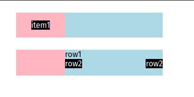
Exercise 13a-13b -
HTML -
<!DOCTYPE html>

<html lang="en">

<head>

<meta charset="UTF-8">

<meta http-equiv="X-UA-Compatible" content="IE=edge">

<meta name="viewport" content="width=device-width, initial-scale=1.0">

<title>Nested flexbox</title>

<link rel="stylesheet" href="exercise13.css">

</head>

<body>

<div class="a">

<div class="aa">

<p class="item1">item1</p>

</div>

<div class="ab">

</div>

</div>

<div class="b">

<div class="ba"></div>

<div class="bb">

<p class="row1">row1</p>

<div class="row2-div">

<p class="row2">row2</p>

<p class="row2">row2</p>

</div>

</div>

</div>

</body>

</html>
CSS -
.a{

display: flex;

margin: 25px;

}

.aa{

width: 100px;

display: flex;

background-color: lightpink;

justify-content: center;

}

.item1{

background-color: black;

color: white;

}

.ab{

width: 200px;

background-color: lightblue;

}

.b{

display: flex;

margin: 25px;

}

.ba{

width: 100px;

background-color: lightpink;

}

.bb{

width: 200px;

background-color: lightblue;

}

.row2-div{

display: flex;

justify-content: space-between;

}

.row1{

margin: 0;

}

.row2{

margin-top: 0;

margin-bottom: 15px;

background-color: black;

color: white;

}
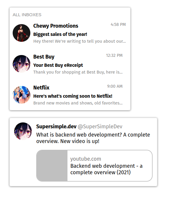
Exercise 13c-13g -
Note - I had to use 'overflow: hidden;' in the gray box to make it work with border-radius of youtube element.
Overflow: hidden property hides anything that goes outside the defined box. In this case, the youtube's embed box.
HTML -
<!DOCTYPE html>

<html lang="en">

<head>

<meta charset="UTF-8">

<meta http-equiv="X-UA-Compatible" content="IE=edge">

<meta name="viewport" content="width=device-width, initial-scale=1.0">

<title>Nested Elements Gmail</title>

<link rel="stylesheet" href="exercise13c13e.css">

</head>

<body>

<div class="box">

<p class="heading">ALL INBOXES</p>

<div class="email">

<img class="icon" src="/9g/1.1.99_19063.jpg">

<div class="text-box">

<div class="flexing">

<p class="title">

Chewy Promotions

</p>

<p class="time">4:58 PM</p>

</div>

<p class="subtitle-text">Biggest sales of the year!

</p>

<p class="text">

Hey there! We're writing to tell you about our...

</p>

</div>

</div>

<div class="email">

<img class="icon"

src="/9g/digital-digital-art-illustration-artwork-eyes-closeup-2157607-wallhere.com.jpg">

<div class="text-box">

<div class="flexing">

<p class="title">

Best Buy

</p>

<p class="time">12:32 PM</p>

</div>

<p class="subtitle-text">Your Best Buy eReceipt

</p>

<p class="text">

Thank you for shopping at Best Buy, here is...

</p>

</div>

</div>

<div class="email">

<img class="icon"

src="/9g/anime-girls-big-boobs.jpg">

<div class="text-box">

<div class="flexing">

<p class="title">

Netflix

</p>

<p class="time">9:00 AM</p>

</div>

<p class="subtitle-text">Here's what's coming soon to Netflix!

</p>

<p class="text">

Brand new movies and shows, old favorites...

</p>

</div>

</div>

</div>

<div class="twitter">

<img class="twit-icon"

src="/9g/digital-digital-art-illustration-artwork-eyes-closeup-2157607-wallhere.com.jpg">

<div class="twit-text-box">

<div class="head">

<p class="accname">

Supersimple.dev

</p>

<p class="username">

@SuperSimpleDev

</p>

</div>

<p class="desc">

What is backend web development?

A complete overview. New video is up!

</p>

<div class="embed">

<div class="video-preview">

</div>

<div class="info">

<p class="youtubecom">youtube.com</p>

<p class="yt-title">Backend web development

- a complete overview (2021)

</p>

</div>

</div>

</div>

</div>

</body>

</html>
CSS -
.box{

max-width: fit-content;

margin: 25px;

box-shadow: 0px 1px 5px rgb(0,0,0,0.5);

border-style: solid;

border-width: 1px;

border-radius: 5px;

border-color: rgba(199, 199, 199, 0.5);

}

.heading{

margin-left: 10px;

margin-bottom: 0;

font-size: 15px;

color: gray;

font-family: Arial, Helvetica, sans-serif;

}

.email{

display: flex;

align-items: center;

}

.icon{

margin-left: 10px;

margin-right: 5px;

width: 60px;

height: 60px;

border-radius: 30px;

}

.text-box{

padding-left: 5px;

padding-right: 15px;

}

.flexing{

display: flex;

justify-content: space-between;

}

.title{

font-weight: bold;

font-size: 18px;

margin-bottom: 0;

}

.time{

color: gray;

font-size: 15px;

}

.subtitle-text{

margin-top: 0;

font-weight: bold;

margin-bottom: 2px;

}

.text{

margin-top: 5px;

font-size: 15px;

color: gray;

}

.twitter{

display: flex;

max-width: 500px;

margin: 25px;

box-shadow: 0px 1px 5px rgb(0,0,0,0.5);

border-style: solid;

border-width: 1px;

border-radius: 5px;

border-color: rgba(199, 199, 199, 0.5);

}

.twit-icon{

margin: 15px;

width: 60px;

height: 60px;

border-radius: 30px;

}

.head{

display: flex;

}

.accname{

font-size: 18px;

padding-right: 2px;

font-weight: bold;

margin-bottom: 2px;

}

.username{

font-size: 18px;

padding-left: 2px;

padding-right: 5px;

color: gray;

margin-bottom: 2px;

}

.desc{

margin-top: 4px;

font-size: 18px;

}

.embed{

display: flex;

margin-right: 15px;

margin-bottom: 15px;

border: solid;

border-width: 2px;

border-color: rgb(192, 192, 192);

border-radius: 20px;

overflow: hidden;

}

.video-preview{

width: 170px;

background-color: rgb(192, 192, 192);

border: none;

}

.info{

padding-left: 10px;

}

.youtubecom{

color: rgb(114, 112, 112);

margin-bottom: 2px;

font-size: 18px;

}

.yt-title{

margin-top: 2px;

font-size: 18px;

}