📚 Chapter 12 - Flexbox
🧶 Tags:: #HTML_CSS
🗃 Resources:: [[]]
Links:: https://github.com/SuperSimpleDev/html-css-course-2022/tree/main/1-exercise-solutions/lesson-12
2022-11-09 - 16:46
Flexbox is similar to CSS grid but more flexible. You can use flexbox in rows and columns like this -
display: flex;
flex-direction: row;
<div style="display: flex;

flex-direction: row;">

<div style="background-color: lightblue;">div1</div>

<div style="background-color: lightpink;" >div2</div>

</div>
Inside a flexbox the div elements don't behave like block elements anymore, they act like inline blocks. They take just as much space they need and not more. Compared to grid which is more rigid, where you have to specify the block sizes.
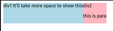
- Flexbox maintains vertical alignment if you add more elements.
- It also flexes in size depending on the contents horizontally.
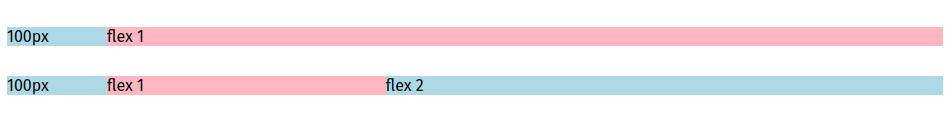
1fr Equivalent -
There are many similarities between flex box and grid.
Something that's similar to 1fr is a property called flex: 1; which acts the same way as grid's 1fr.
<div style="margin-top: 30px;

display: flex;

flex-direction: row;">

<div style="background-color: lightblue;

width: 100px;">100px</div>

<div style="background-color: lightpink;

flex: 1;">flex 1</div>

<div style="background-color: lightblue;

flex: 2;">flex 2</div>
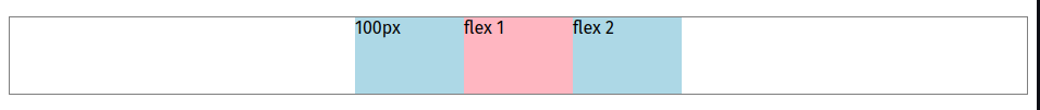
In a flexbox the elements carry their sizes with them
For example -
<div style="background-color: lightblue;

width: 100px;">100px</div>
The width is 100px in the above example. So if you move the element anywhere they carry the right size with them as defined by width (in this example) or height. This is not similar to grid, where you have to set the grid parameters separately. Which causes its own issues if you move the DIV elements inside.
<div style="

margin-top: 30px;

display: grid;

grid-template-columns: 100px 1fr 2fr;

">

<div style="background-color: lightblue;">100px</div>

<div style="background-color: lightpink;">1fr</div>

<div style="background-color: lightblue;">2fr</div>

</div>
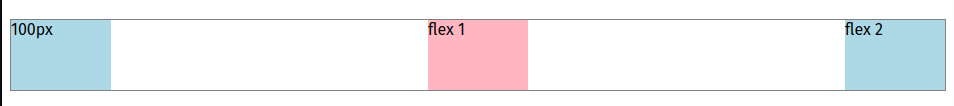
Justify Content -
Justify content is a property that can be used to tell the flexbox how to align the item, You can use justify content: start, center, and end;
Example of justify-content: center;
You can also use properties like - justify-content: space-between; to align equally across our DIV. Space between makes sure there is equal amount of space between the elements.
Example of justify-content: space-between;
Exercise 12a-12d -
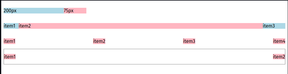
HTML -
<!DOCTYPE html>

<html lang="en">

<head>

<meta charset="UTF-8">

<meta http-equiv="X-UA-Compatible" content="IE=edge">

<meta name="viewport" content="width=device-width, initial-scale=1.0">

<title>FLEX BOX EXERCISE</title>

<link rel="stylesheet" href="exercise12.css">

</head>

<body>

<div class="a">

<p class="lightblue">200px</p>

<p class="lightpink">75px</p>

</div>

<div class="b">

<p class="item1">item1</p>

<p class="item2">item2</p>

<p class="item3">item3</p>

</div>

<div class="c">

<p class="item">item1</p>

<p class="item">item2</p>

<p class="item">item3</p>

<p class="item">item4</p>

</div>

<div class="d">

<p class="itema">item1</p>

<p class="itema">item2</p>

</div>

</body>

</html>
CSS -
.a{

display: flex;

}

.lightblue{

background-color: lightblue;

width: 200px;

}

.lightpink{

background-color: lightpink;

width: 75px;

}

.b{

display: flex;

}

.item1{

background-color: lightblue;

width: 50px;

}

.item2{

background-color: lightpink;

flex: 1;

}

.item3{

background-color: lightblue;

width: 75px;

}

.c{justify-content: space-between;

display: flex;

}

.item{

background-color: lightpink;

}

.d{

display: flex;

height: 50px;

border-style: solid;

border-width: 1px;

border-color: gray;

justify-content: space-between;

}

.itema{

background-color: lightpink;

}
Exercise 12e-12g -
HTML -
<!DOCTYPE html>

<html lang="en">

<head>

<meta charset="UTF-8">

<meta http-equiv="X-UA-Compatible" content="IE=edge">

<meta name="viewport" content="width=device-width, initial-scale=1.0">

<title>EXERCISE 12 FLEX BOX</title>

<link rel="stylesheet" href="exercise12e-12g.css">

</head>

<body>

<div class="e">

<div class="ee">

<p class="name">Home</p>

<p class="num">14</p>

</div>

<div class="ee">

<p class="name">Notifications</p>

<p class="num">3</p>

</div>

<div class="ee">

<p class="name">Messages</p>

<p class="num">5</p>

</div>

</div>

<div class="twitter-follow">

<img class="propic" src="/9g/1.1.99_19063.jpg">

<div class="info">

<p class="user">Olivia</p>

<p class="des">the cat</p>

<p class="popular">popular</p>

</div>

<button class="follow">Follow</button>

</div>

<div class="twitter-follow">

<img class="propic" src="/9g/anime-girls-big-boobs.jpg">

<div class="info">

<p class="user">Mini</p>

<p class="des">Sleepy Cat</p>

<p class="popular">popular</p>

</div>

<button class="follow">Follow</button>

</div>

<div class="twitter-follow">

<img class="propic" src="/9g/bgkawaii.jpg">

<div class="info">

<p class="user">Reina</p>

<p class="des">Happy Cat</p>

<p class="popular">popular</p>

</div>

<button class="follow">Follow</button>

</div>

<div class="search">

<p class="home">Home</p>

<input class="s-box" type="text" placeholder="Search">

<button class="download">Download</button>

</div>

</body>

</html>
CSS -
.{

font-family: Arial, Helvetica, sans-serif;

margin: 0;

}

.e{

width: 400px;

border-style: solid;

border-width: 1px;

border-radius: 3px;

border-color: gray;

margin-bottom: 25px;

}

.ee{

display: flex;

justify-content: space-between;

padding-left: 20px;

padding-right: 20px;

}

.name{

font-weight: 500;

font-size: 18px;

margin: 8px;

}

.num{

padding-left: 10px;

padding-right: 10px;

font-weight: bold;

font-size: 20px;

background-color: rgb(0, 140, 255);

color: white;

border-radius: 20px;

margin: 7px;

}

.twitter-follow{

width: 400px;

display: flex;

align-items: center;

margin-left: 20px;

}

.propic{

margin-left: 15px;

width: 60px;

height: 60px;

border-radius: 50px;

margin-right: 5px;

}

.info{

flex: 1;

line-height: 8px;

margin-left: 5px;

}

.follow{

width: 80px;

background-color: rgb(60, 145, 255);

border: none;

padding: 8px;

margin-right: 15px;

color: white;

font-size: 16px;

font-weight: 600;

border-radius: 6px;

}

.user{

font-weight: bold;

font-size: 18px;

}

.des{

font-weight: 400;

font-size: 18px;

color: gray;

}

.popular{

color: gray;

}

.search{

margin-top: 25px;

display: flex;

justify-content: space-between;

margin-left: 5px;

margin-right: 5px;

background-color: rgb(153, 79, 223);

margin-bottom: 500px;

}

.home{

font-weight: bold;

margin-left: 15px;

color: white;

padding-right: 10px;

}

.s-box{

width: 500px;

border-radius: 50px;

margin-top: 10px;

margin-bottom: 10px;

border: none;

padding-left: 18px;

padding-right: 18px;

font-weight: 400;

max-width: 500px;

}

.download{

margin-right: 10px;

margin-top: 8px;

margin-bottom: 8px;

border: solid;

border-radius: 3px;

border-width: 1px;

border-color: white;

background-color: rgb(153, 79, 223);

color: white;

padding-left: 15px;

padding-right: 15px;

font-size: 15px;

transition: 1s;

}

.download:hover{

background-color: rgb(114, 31, 192);

}